Microsoft Word accessibility checklist
Overview
Use this page to help you make a Word document more accessible, whether you plan to save it later as a PDF or want to keep it as a Word file.
Checklist
This checklist won't cover every accessibility problem, but it will highlight some of the main issues that could arise.
- Have you used an accessible template?
- Have you checked your headings and structure?
- Are there any lists? Should there be?
- Are there tables in your document?
- Have you used small text or mixed fonts?
- What text styling have you used?
- Have you used text boxes?
- Have you checked your use of colour?
- Is any information identified by its position, colour or sound?
- Are there images, charts or graphs?
- Have you used descriptive links?
- Offer different formats if your Word document isn't fully accessible
1. Have you used an accessible template?
A Word template contains things like pre-set heading, text and table styles to make creating a consistent document easier.
Starting with an accessible Word template, or copying your content into one, increases accessibility provided you use styles appropriately. It should make your page elements more accessible for screen readers and things like font sizes and colours will follow accessibility standards and good practice.
A test version of an accessible University of Leeds Word template is available. Remember to remove the placeholder copy you don't want to re-use.
Microsoft's Accessible Office Templates page contains several downloadable Word templates that you may find useful.
Return to the top of the page.
2. Have you checked your headings and structure?
Ensure headings and subheadings have heading styles applied, and that you don't just apply bold or enlarged font to text to indicate a new page section. See our guidance on headings.
Correctly used headings introduce structure. Bear in mind that headings are nested from the lowest number (usually stated as ‘Heading 1’ to the highest) to help communicate the visual hierarchy communicated by larger or bolder text styles to assistive technologies, such as screen readers.
You should be able to find heading types in the 'Styles' section of Word's 'Home' tab.
Ensure your main title has a style of Heading 1 instead of using the Title style, which can be less usable than opting for Heading 1.
Return to the top of the page.
3. Are there any lists? Should there be?
If there's a list it must be set using the bulleted list or numbered list buttons. They shouldn’t be copied in from elsewhere, such as a web page.
If you’re listing something in a paragraph, would it be easier to understand in a bulleted or numbered list?
Return to the top of the page.
4. Are there tables in your document?
If a tables covers more than a handful of columns and rows consider splitting it into several smaller tables or sharing the information in another format, such as a spreadsheet.
You shouldn't use tables to simply layout or structure a document, such as to create a digital form.
- Only use tables for data and only where necessary.
- Create tables in Word. Tables should not be inserted as an image because screen readers won’t read out the data.
- Ensure tables don’t contain blank cells, split cells, merged cells, or nested tables.
- All tables in your document need to be formatted. Check 'header rows', 'banded rows' and 'first column' are selected on your table and add alt text.
For more detailed help, read our guidance on creating accessible tables.
Return to the top of the page.
5. Have you used small text or mixed fonts?
Body text of 14pt is considered accessible and should be the minimum across your document. Headings should be larger to help indicate information hierarchy. See our guidance on headings.
It's better to use as few fonts as possible. Using a variety of fonts can become confusing and hard to read for some people, such as those with partial sight or cognitive disabilities.
If in doubt, use Arial or other frequently used, commonly available fonts. WebAim's advice on typefaces and fonts has useful guidance on font accessibility.
Return to the top of the page.
6. Have you used text styling correctly?
The Word accessibility checker doesn’t check for plain text, font size, bold, italics or acronyms – make sure you do a manual check to be sure you've used these things accessibly.
Manually check styling
Fonts
Use simple fonts - sans serif typefaces such as Calibri and Arial.
Bold/Italic
Avoid bold on more than a few words and remove any italics. This should help people with dyslexia.
Abbreviations
Make sure the long form is included with the abbreviation in the first instance. Define the abbreviation again later in the document if you think it will be useful.
Use Word styles
Use the 'Styles' section of Word's 'Home' tab to help ensure your document communicates better with assistive technologies, such as screen readers. This is where you'll find heading styles and, depending on the template, other useful styles that will automatically change text to the correct kind, size and font.
Return to the top of the page.
7. Have you used text boxes?
Avoid using text boxes because they can cause issues for screen readers. Where possible, place the text within the page body itself.
Return to the top of the page.
8. Have you checked your use of colour?
Nowhere in your document can you use colour alone to convey meaning. There should be additional text or something in the page set-up that explains what the colour difference is communicating.
For example, you may have colour-coded headings or references. However, neither a screen-reader nor someone with colour-blindness will receive that purely visual information.
Check the colour contrast
Colour combinations in your document must meet a contrast ratio of at least 3:1 for objects and for text that’s 18pt and higher or 14pt bold and higher. Text below this size should meet a 4.5:1 ratio.
To check the colour contrast you can use the WebAIM colour contrast checker or another colour app checker. TGPi’s Colour Contrast Analyser is a simple desktop program that can measure any colour combination on your screen.
Tip: Choose an off-white background. Some people find a pure-white background makes documents challenging to read.
Return to the top of the page.
9. Is any information identified by its position, colour or sound?
- Avoid purely visual references. Change 'above' and 'below' to 'previously' and 'following' respectively.
- Adjust 'left' and 'right' to something not exclusively visual (eg 'data in the Results column' not 'right-hand column’).
- Don't identify something by colour alone (eg use 'green submit button' not 'green button').
Return to the top of the page.
10. Are there images, charts or graphs?
Ensure all informative images, charts, graphs and tables have descriptive alt text. Screen readers read out the description to visually impaired users so they can understand what the item represents. For detailed information, read our guidance on images and alt text.
Alt text
- All informative images in your presentation need alt text – a description of the image.
- Aim to keep your descriptions short – two sentences maximum.
- Decorative images can be marked as such and do not need a description.
Add alt text
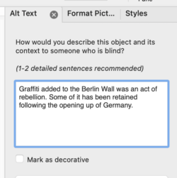
To set alt text:
- Right-click on the image requiring alt text and select ‘Edit Alt Text’ on the drop-down list.
- Add your image description to the ‘Alt Text Pane’ that appears on the right-hand side of the screen.
- If the image is decorative, for example a border or other styling, you can leave the description blank and check ‘Mark as decorative’ box.
If you have more detailed images like graphs or charts please see our guidance on complex images.
Return to the top of the page.
11. Have you used descriptive links?
- Ensure link text (the highlighted words that become the link) is descriptive enough so you can know where the link leads when it’s heard without the surrounding content.
- A good idea is to reflect the title of the destination page in the link text and indicate whether it’s a file link - use (PDF), (Word doc) etc in the link text.
Insert descriptive links
See our information on links for more detail.
Tip: If your presentation will be printed, you may want to include the plain URL with the link. For example:
Masters courses at the University of Leeds (leeds.ac.uk/masters).
Plain URLs could also be listed at the end of the document in an addendum or appendix.
Return to the top of the page.
12. Offer different formats if your Word document isn't fully accessible
If you’re unable to make your Word document fully accessible, you can supplement it with one or more additional resources, so that in combination you provide information which is accessible.
For example, if elements of your Word document are not accessible, you could create a web page which covers the same information.
If you’re unable to provide an alternative version it is important to make this clear wherever the content is presented/linked to or in your module accessibility statement so that students or staff can seek appropriate advice or support if they need it.
Using examples of previous student work as a learning aid
If you’re using a Word document example of student work as a learning aid it needs to be made accessible. However, there may be good reasons to leave the original work untouched to illustrate exactly what the student produced.
In this case, the original work should be supplemented with an alternative resource which addresses any accessibility issues. This could be an updated version of the original work that meets accessibility requirements or a different document which addresses any missing content (e.g. alt text descriptions of images/diagrams).
Please note: If you edit a student’s work this may impact on its copyright status, which may be relevant in a small number of cases.
Do you need to make something accessible even if you think disabled people won't use it?
Yes, even if you’re not aware of any disabled students or staff using your content you still need to make materials accessible. Following accessibility guidelines improves the usability of websites, documents and systems for everyone. Making content accessible means students and staff will benefit from being able to engage with the information in more flexible ways.
Return to the top of the page.
Other useful resources
- Accessibility checks in Word
- Blackboard Ally checks
- Third-party content
- Useful links
- Microsoft Word accessibility tutorials
Return to the top of the page.
Accessibility checks in Word
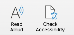
Microsoft Word comes with a number of useful tools to help in producing accessible documents, such as 'Read Aloud' and 'Check Accessibility'.
'Read Aloud' tool
This tool will read your text back to you and is used by some students and staff to help their comprehension of documents. Using it will demonstrate the experience you can expect them to have and may help your pinpoints problems that should be fixed. It can also give you a rough idea of how screen readers may announce your document.
'Check Accessibility' tool
This tool will provide you with a very rough overview of how accessible your document is. For example, it will tell you if your non-decorative images lack alternative text.
You should, however, only use this built-in checker as your first draft accessibility check. For example, it won’t tell you if your font choice or point size are hard to read, or if your alt text is appropriate.
Using this checklist is a more robust way to be sure of good accessibility compliance.
Blackboard Ally checks
Blackboard Ally is embedded within Minerva and has two functions:
- It allows you to identify and improve accessibility issues for files.
- It automatically provides students with access to alternative formats of the files hosted on Minerva such as electronic braille, HTML and audio.
Blackboard Ally automatically scans all content uploaded to Minerva, and all uploaded files are accompanied by an accessibility indicator that allows you to evaluate and improve the accessibility of the content. It looks like a red, orange, or green gauge. Please note that the indicator is not visible to students.
The colour of the accessibility indicator signifies issues with the file – red indicates significant issues, whilst green indicates minor or no issues. You can access guidance on how to address these issues by clicking on the indicator.
Blackboard Ally also gives students access to files in multiple formats, such as braille, html and mp3 audio.
Ally limitations
Blackboard Ally is very similar to Word's accessibility checker but there may be some differences, for example Blackboard Ally might identify an issue with colour contrast, whereas the Word accessibility checker won't.
There are also limitations, for example Ally can't assess quality of image descriptions. Leaving alt text blank, to indicate the image is decorative, may also mean Ally flags it as an issue.
Ally is also currently unable to recognise where materials meet accessibility requirements by supplementing each other. For example, where visual content is made accessible by supplementing it with a written description in a separate document, Ally’s score for the visual content will not be updated.
When to use automated checkers
If you can, run the Word accessibility checker first before uploading your file to Blackboard Ally. Always note any extra issues flagged by Blackboard Ally as it not only evaluates files but it provides students with alternative formats of those files.
For further information on using Blackboard Ally see:
- Blackboard Ally Quick Start guide
- Information on Alternative Formats (note translations is disabled at Leeds)
Third-party content
You don't need to recreate all inaccessible third-party content, but you do need to ensure people can access essential information and learning materials.
If a website is not owned, funded or supported by the university then its content is not legally required to be made accessible by us.
However, we are required to provide learning opportunities that are accessible to all students. If essential third-party content is not fully accessible then it should be supplemented with one or more other resources, so that in combination they meet the needs of all students.
For example, if an external website (which includes essential learning materials) has content that relies on colour alone to convey meaning, then it could be supplemented with a separate explanation that covers what the use of colour communicates.
Similarly, if you're linking to third-party content that is essential, such as to complete a compulsory step in a process, you should provide an alternative accessible route to achieving the same thing.
Useful links
- Microsoft: How to create accessible Microsoft office documents
- Ability Net: Creating Accessible Documents
- What is a Screen Reader?
- Alternative communication systems for people with severe motor disabilities: a survey (nih.gov)
- What is colour blindness?
Microsoft Word accessibility tutorials
Learn how to create more accessible Word documents with training videos and online tutorials created by Microsoft:
- Access Create More Accessible Word Documents training (support.office.com)
- How to make your Word documents accessible for people with disabilities (support.office.com)
- Learn about the Accessibility Checker (support.office.com)
- Improve accessibility with the Accessibility Checker (support.office.com)
- Word tips and tricks (support.office.com)