Accordions
On this page
Overview
Accordions should be used sparingly if possible. Although the accordions available to use on University sites will be accessible, they will always risk causing users difficulty as interaction is necessary to see the information.
Always use the buttons or features provided in a content management system (CMS), typically Jadu or WordPress, to create an accordion. Never use your own code to set an accordion. This will ensure they are accessible.
Accordions will have pre-set header numbers. Please see our guidance on headings for more information to make sure your heading structure meets accessibility requirements.
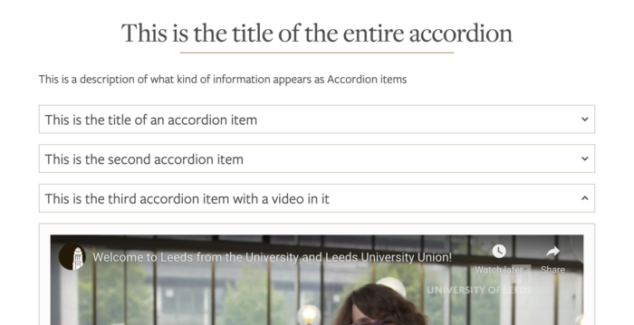
What and why: An accordion is a vertically stacked container with a title and some content. Accordions are used to make navigating a page easier and to reduce the need for scrolling.
Return to the top of the page.
How to
Accordions for Jadu users
How to create an accordion in older versions of Jadu
Some older instances of Jadu in the University require accordions to be set using HTML. We recommend most content owners/creators to not edit HTML and instead to consider reorganising their content and use headings accessibly.
How to create an accordion in Jadu Continuum
- Place your cursor in the place where you would like the first accordion header to be.
- Select the accordion icon in the menu bar.
- Add in the header in the ‘Title Text’ field and the content for the accordion panel in the ‘Body Text’ field.
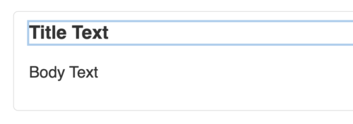
- To add another accordion header and panel underneath, just place your cursor directly underneath the first accordion content you made and select the accordion button Jadu again.
Return to the top of the page.
Accordions for WordPress users
To create an accordion in WordPress, first make sure that you are using the ‘Widgets Page Template’. This can be selected under the 'Template' drop-down in the Page Attributes box in the editor page.
Be aware that changing the template after adding content to your page can put that content at risk. We'd recommend copying your content into Notepad and saving it as a back-up before changing the template.
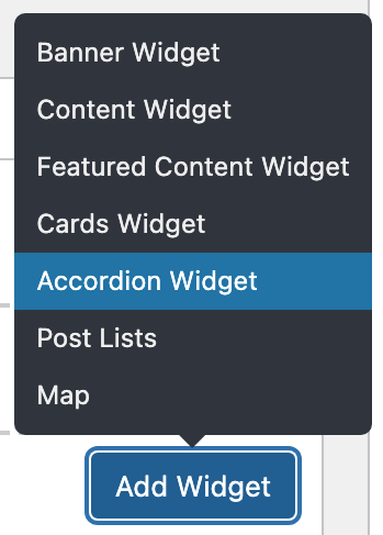
- Select the 'Add Widget' button, then choose 'Accordion Widget'.
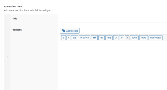
- An empty Accordion Item container will be displayed on the page.
- You can add a header for the accordion section in the 'Title' field. The optional 'Lead' field allows you to add some useful information.
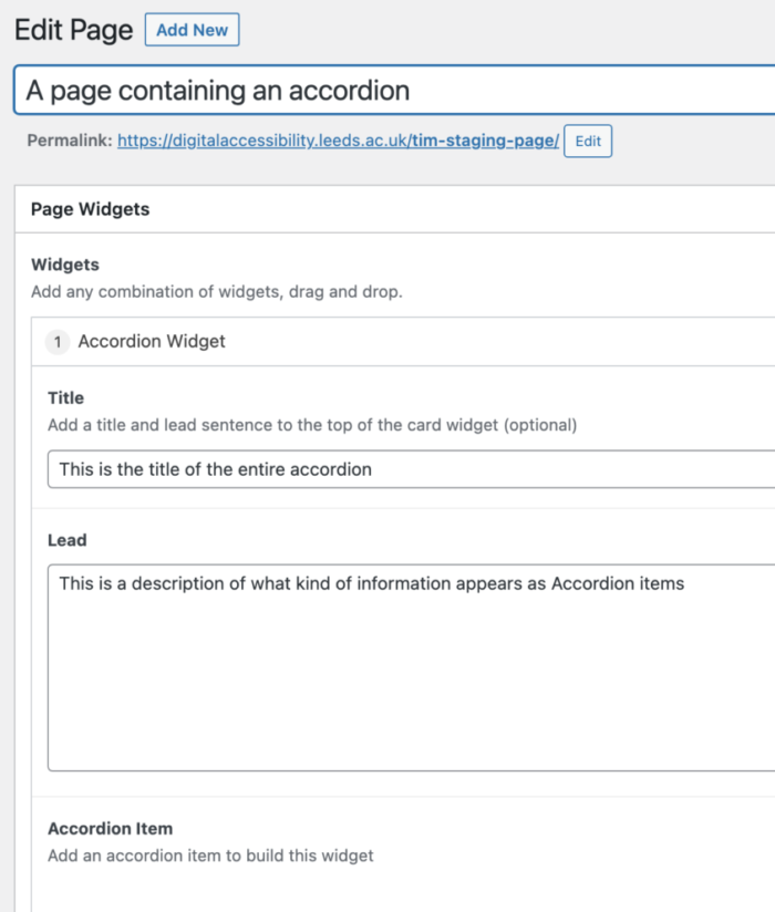
- Select the ‘Add Accordion Item’ button. Add the accordion header in the 'title' field and the content in the 'content' field.
Return to the top of the page.
Accordions for SharePoint users
SharePoint's version of accordions is collapsible sections. It's not possible to create an accordion in a subsection of a larger section. Either the whole section is collapsible or none of it is.
Collapsible sections must be given a 'Section name' that SharePoint will set as a Heading 2. It's not possible to change the heading level. Ensure that any headings you use within this section follow the appropriate hierarchy, as explained in our headings guidance.
How to create a collapsible section (accordion) in SharePoint
- Select 'Edit section' in the section toolbar.
- Set the toggle for 'Make this section collapsible' to 'On' in the 'Section' options panel.
- If you would like the section to be collapsed so its content is hidden when someone loads the page, set the toggle for 'Default display' to 'Collapsed'.
- Write the section heading in the 'Section name' field in the page editor.
